

Somewhere along the way, the little sun-and-moon icon became practically mandatory across the digital landscape. Whether visiting a personal portfolio, reading through complex technical documentation, or landing on a business-to-business SaaS landing page, users are almost universally greeted by the familiar toggle. Naturally, it sits proudly in the header, rubbing shoulders with the core navigation items and the primary calls-to-action—the very things people actually came to the page to use.
Yet, beneath the polished interfaces and sleek design systems, a slightly uncomfortable question is beginning to surface among user experience professionals: does this button really deserve to be there?
Web standards and UX expert Lea Verou has sparked a broader conversation by arguing that most websites probably shouldn’t have a persistent dark mode toggle at all. Her argument is not that dark mode itself is flawed or unappealing. Millions of users rely on dark themes to reduce eye strain, conserve battery life on mobile devices, or simply fit their personal aesthetic preferences. Instead, Verou’s critique targets the allocation of digital space, suggesting that designers may have given a relatively minor preference an awful lot of prime interface real estate.
And as the digital design community begins to examine its own habits, many are finding that she may have a point.
Are We Designing This for Ourselves?
While exploring the issue and analyzing contemporary web trends, Verou noticed a striking pattern: the persistent dark mode toggles she encountered were overwhelmingly concentrated on developer-facing websites, tech blogs, and design portfolios. While this observation is not formal proof that ordinary, mainstream users do not care about dark mode, it raises a much deeper, more probing question about industry groupthink. Have web designers embraced the prominent toggle partly—or even largely—because other designers are doing it?
In the tight-knit ecosystem of web development and digital design, trends travel fast. A novel UI pattern emerges on a prominent tech platform, gains traction among industry influencers, and quickly trickles down into a standard checklist item for every new project. Over time, the pattern becomes institutionalized, divorced from its original utility and immune to critical evaluation.
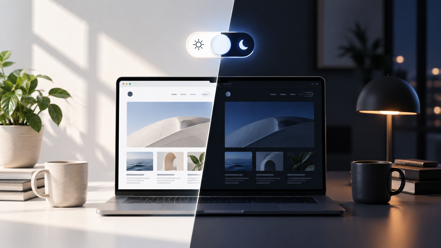
Meanwhile, the underlying technology has evolved significantly. Modern web browsers have been capable of detecting a user’s system-level light-or-dark preference automatically for years through standardized media queries. Operating systems across mobile and desktop environments now allow users to set a global preference that applies across applications and web browsing sessions. A website can simply respect that system preference automatically upon loading, gracefully rendering the appropriate color scheme without requiring any manual intervention from the visitor.
For the small percentage of users who might want to override their system settings for a specific site, an option can still be provided. However, that override does not necessarily need to occupy prime pixel real estate in the main header navigation. It can live comfortably in a settings menu, a footer, or an accessibility panel, out of the way of primary workflows.
In other words, nobody is coming to take away dark mode. The ongoing discussion is simply questioning whether a tertiary feature needs its own prominent seat at the table.
The Evolution of a Micro-Problem
As the debate surrounding interface clutter has gained traction, the discourse has become surprisingly elaborate, highlighting the web design industry’s unique tendency to overcomplicate simple interactions. Verou has previously advocated for a streamlined two-state approach rather than the increasingly convoluted Light, Dark, and System trios that have become common in modern applications.
This discussion has not only inspired thoughtful technical implementations but has also given rise to tongue-in-cheek commentary. Among the responses to the trend is a deliberately ridiculous joke featuring a one-hundred-state dark mode control, mocking the endless granularity that some developers introduce to basic interface elements. While humorous, the satirical creation exposes something that web design does remarkably well: turning tiny, manageable problems into elaborate, over-engineered interface solutions.
When every new project inherits a standard template of assumed best practices, interfaces begin to bloat. Every single button, toggle, and badge added to a header asks for user attention and cognitive processing power. More importantly, every fashionable user interface pattern eventually deserves to face the hardest question that designers hate asking themselves: Is this feature here because users genuinely need it, or simply because other designers have it?
As the industry continues to mature, the pushback against redundant dark mode toggles serves as a broader reminder of the value of intentional design. By stripping away unearned interface elements and relying more heavily on native browser capabilities, designers can create cleaner, more focused digital environments that respect both user attention and screen real estate.









No comments yet. Be the first to join the conversation!