
The Visual Yield of Information Security A Deeper Look
The visual yield of information security is more than just pretty pictures; it’s a powerful tool for understanding and mitigating risks. From visualizing complex network architectures to presenting security policies in an easily digestible format, visual representations can significantly enhance our comprehension of security challenges and solutions. This exploration delves into the practical applications of visual aids in the field of information security, examining how effective visualizations can strengthen security protocols, improve user understanding, and ultimately, make our digital world safer.
This post will cover various visual tools and techniques, ranging from basic charts and graphs to more advanced models like network diagrams and flowcharts. We’ll explore how these tools can help visualize threats, vulnerabilities, security controls, user training materials, and even security audit results. By providing concrete examples and case studies, we’ll show the tangible impact of visualization on information security initiatives.
Defining Visual Information Security
Visual information security, a crucial component of overall cybersecurity, transcends the traditional numeric and textual realms. It encompasses the use of visual representations to enhance understanding, detection, and prevention of security threats. Effective visual communication aids in conveying complex security information to diverse audiences, fostering a shared understanding of potential vulnerabilities and risk mitigation strategies. This approach empowers individuals and organizations to proactively address security challenges.Visual yield, in the context of information security, refers to the ability of visual representations to efficiently communicate complex security data and insights.
Visualizations transform raw data into easily digestible forms, making it easier to spot patterns, trends, and anomalies that might indicate security risks or vulnerabilities. This is critical because visual representations often reveal connections and relationships that are difficult or impossible to discern from purely textual or numerical data.
Importance of Visual Representations
Visual representations are essential for understanding security risks and vulnerabilities because they simplify complex data, allowing for quick comprehension and identification of potential threats. The human brain processes visual information significantly faster than text-based information. Visualizations enable analysts to quickly identify anomalies, trends, and patterns in security data, which can lead to faster incident response and mitigation.
Different Forms of Visual Representations
Visual representations in information security encompass various formats, each serving a specific purpose. These formats include but are not limited to charts, graphs, and diagrams.
- Charts: Charts are used to display data in a visually organized manner. Bar charts, for example, effectively compare different data points, highlighting significant differences or trends. Line charts can illustrate the progression of data over time, allowing for the identification of patterns or fluctuations. Pie charts visually represent proportions or percentages, providing a quick overview of the distribution of data elements.
- Graphs: Graphs are more advanced visualizations than charts, offering insights into complex relationships between variables. Scatter plots display the correlation between two variables, allowing analysts to identify potential patterns or trends. Network graphs are useful for depicting interconnected data, such as the relationships between users, systems, or network components, helping to uncover potential vulnerabilities or attack pathways.
- Diagrams: Diagrams are used to illustrate complex processes, architectures, or relationships. Flowcharts, for instance, depict the steps in a process, while network diagrams show the connections and dependencies between various components in a network. Entity-relationship diagrams visualize the relationships between different entities, which is helpful for understanding data flow and potential vulnerabilities in database systems.
Visual Representation Comparison
| Representation Type | Strengths | Weaknesses | Use Cases |
|---|---|---|---|
| Bar Charts | Easy to understand, visually compare categories | Limited for showing trends over time | Comparing attack frequencies, user access levels, system vulnerabilities |
| Line Charts | Excellent for showing trends over time | Less effective for comparing categories directly | Tracking security incidents, analyzing intrusion attempts, identifying user behavior patterns |
| Scatter Plots | Identifying correlations between variables | Can be difficult to interpret with many data points | Analyzing user behavior, identifying anomalies, assessing risk factors |
| Network Diagrams | Visualizing complex relationships, identifying dependencies | Can become cluttered with many nodes and connections | Mapping network infrastructure, identifying potential attack paths, visualizing data flow |
Visualizing Threats and Vulnerabilities
Visualizing security threats and vulnerabilities is crucial for effective risk management. By translating abstract concepts into tangible, visual representations, security teams can better understand potential attack paths, identify weaknesses in their systems, and prioritize remediation efforts. This allows for more proactive security measures and better allocation of resources.Visualizations allow for easier communication and comprehension among security professionals, enabling more effective collaboration and decision-making.
The ability to quickly identify critical vulnerabilities and potential attack vectors through visual aids fosters a more informed and responsive security posture.
Common Security Threats Visualizable
Common security threats, such as phishing attacks, malware infections, and denial-of-service (DoS) attacks, can be effectively visualized. Visualizations can highlight the stages of an attack, illustrating how threats unfold and spread. For example, a timeline diagram can illustrate the sequence of events in a phishing campaign, showing the initial contact, the lure, and the final compromise.
Network Diagrams and Vulnerabilities
Network diagrams are particularly useful for visualizing security vulnerabilities. These diagrams, showing the flow of data and the connections between different systems, can highlight potential attack paths. A compromised device within a network, for example, can be visually represented as a red node in a diagram, immediately drawing attention to a security vulnerability. Network diagrams can also illustrate the spread of malware or the impact of a DoS attack on different parts of the network.
Visualizing Data Breaches, The visual yield of information security
Visual models can represent data breaches effectively. A circular chart, for example, can depict the sensitive data types affected, showing the proportion of each type compromised. Color-coding can further highlight the severity of the breach. Visualizations can also show the financial or reputational impact of the breach by depicting the potential loss in revenue or customer trust.
Visual representations of information security can be powerful, but the impact of misinformation, especially when presented visually, is undeniable. Take a look at how the debate around journalistic integrity continues, even after a respected figure’s passing, as seen in the recent discussion surrounding Walter Cronkite, death hasn’t softened right-wing bloggers toward Cronkite. Ultimately, the visual presentation of security information is crucial for understanding its complexities and ensuring its effective communication.
Flowcharts for Attack Paths
Flowcharts can visually represent attack paths. They depict the sequence of actions an attacker might take, from initial reconnaissance to gaining access to sensitive data. By visualizing the attack path, security teams can identify critical points in the process where intervention can be most effective. This visual representation aids in the development of mitigation strategies. A flowchart illustrating a potential SQL injection attack, for example, would clearly depict the steps from the initial query to the eventual data exfiltration.
Threat Modeling Visualizations
Visualizations play a vital role in threat modeling, providing a comprehensive overview of potential security risks. This section presents a table outlining various visualization types, their descriptions, use cases, and associated strengths and weaknesses.
| Visualization Type | Description | Example Use Case | Strengths | Weaknesses |
|---|---|---|---|---|
| Network Diagrams | Visual representation of network topology, devices, and connections. | Identifying potential attack paths, visualizing network segmentation, mapping out critical infrastructure. | Clear representation of network structure, allows for quick identification of vulnerabilities. | Complexity can increase with large networks, requires accurate data input. |
| Flowcharts | Step-by-step representation of attack paths or security processes. | Modeling a phishing campaign, visualizing malware execution, defining security procedures. | Easy to understand, clarifies the sequence of events, useful for training. | Can be complex for multifaceted attacks, may not capture all nuances of a real-world attack. |
| Sankey Diagrams | Visualizing the flow of data or resources. | Depicting data flow within a system, showing data breaches, visualizing resource consumption. | Effective for showing relationships and dependencies, highlights data movement. | May not be suitable for very complex data flows. |
Visualizing Security Controls and Measures: The Visual Yield Of Information Security
Visualizing security controls and measures is crucial for effective communication, understanding, and management. A clear visual representation allows security teams and stakeholders to grasp the complexity of security policies and procedures, facilitating better implementation and compliance. This approach promotes proactive identification of potential vulnerabilities and facilitates more effective incident response.
Visual Representations of Security Controls
Security controls encompass a wide range of measures, from access restrictions to intrusion detection systems. Effectively communicating these controls requires visual representations that translate complex technical concepts into easily digestible formats. Using diagrams, charts, and dashboards can dramatically improve understanding and collaboration among security personnel.
Examples of Visualizing Security Policies
Security policies often Artikel specific procedures and guidelines for employees. These policies can be visualized using flowcharts that clearly depict the steps involved in a particular process, such as password management or data handling. For example, a flowchart illustrating the steps for reporting a security incident would visually guide personnel through the reporting process. Another method is using infographics that present policy summaries in a visually appealing manner, enhancing comprehension.
Visualizing security policies improves adherence and minimizes ambiguity.
Visual Aids for Security Procedures
Visual aids, such as diagrams and videos, can effectively demonstrate security procedures. Interactive simulations of potential threats and vulnerabilities can provide a hands-on learning experience, enhancing employee awareness and preparedness. For example, a short video demonstrating proper data handling procedures can effectively illustrate the correct way to handle sensitive information. This practical approach enhances security awareness.
Visualizing information security can be tricky, but it’s crucial. Think about how a phone’s design, like Nokia’s new Surge smartphone, visually communicates security features. Nokia chases social crowd with new surge smartphone by highlighting certain design elements. Ultimately, a strong visual component in security is vital for user trust and understanding, even if it’s subtle.
Dashboards for Security Metrics
Security dashboards provide a concise overview of key security metrics, enabling real-time monitoring of critical aspects of security posture. These dashboards typically display data related to intrusion attempts, system vulnerabilities, and user activity. For instance, a dashboard might track the number of suspicious login attempts, the number of identified vulnerabilities, and the average response time to security incidents.
These dashboards provide a snapshot of the overall security state and facilitate proactive security management.
Table of Security Control Visualizations
| Control Type | Visualization Method | Data Displayed | Example |
|---|---|---|---|
| Access Control | Flowchart | Steps involved in granting/denying access | A flowchart showing the process for verifying user credentials before granting access to sensitive files. |
| Network Security | Network Topology Diagram | Network architecture, devices, and connections | A diagram depicting the network layout, highlighting firewalls, intrusion detection systems, and other security controls. |
| Incident Response | Timeline | Steps and time taken in response to a security incident | A timeline showing the various stages of an incident response process, from detection to containment and recovery. |
| Vulnerability Management | Heatmap | Severity and risk levels of vulnerabilities | A heatmap showing vulnerabilities categorized by their severity and potential impact. High-risk vulnerabilities would be displayed with more intense colors. |
Enhancing User Understanding of Security

Visual aids play a crucial role in improving user comprehension of complex security concepts. By translating abstract ideas into easily digestible visuals, organizations can effectively communicate security risks and preventative measures. This enhanced understanding directly translates into better security practices and a more resilient digital environment.Visual communication is no longer a luxury but a necessity in modern security awareness training.
Clear and engaging visuals capture attention, facilitate retention, and encourage active participation, leading to a higher level of understanding and improved security behaviors. This approach is especially important for non-technical users, making security information accessible and relatable.
Visual Aids in Security Awareness Training
Effective security awareness training leverages visual aids to make complex information accessible. Visual representations of threats, vulnerabilities, and security controls can significantly enhance understanding, reducing the risk of user error and improving overall security posture. This approach facilitates comprehension and retention of crucial security information, transforming abstract concepts into concrete, easily understood images.
Examples of Infographics for Security Messages
Infographics are powerful tools for conveying security messages. Consider an infographic depicting a phishing attack, illustrating the steps involved in a phishing attempt and showing how users can identify and avoid such attacks. Another example might be a flowchart outlining the steps in a secure password management system. Visualizing the attack path or a data breach process can help employees recognize potential vulnerabilities.
Visualizing information security can be tricky, but recent advancements like Microsoft’s innovative approach to security, microsoft achieves trifecta with hohm , are helping. This new system promises clearer insights into potential threats, ultimately improving the overall visual yield of security measures. It’s all about making the complex understandable, which directly impacts our ability to proactively address vulnerabilities.
The use of colors, icons, and concise text can highlight key points, making the information more memorable and easily understandable.
Comparing Visual Communication Methods
| Method | Strengths | Weaknesses | Target Audience |
|---|---|---|---|
| Infographics | Captures attention, visually appealing, concise, easy to understand, good for broad audiences | Can be simplistic, might not convey highly complex information, potentially oversimplifying | General users, employees, executives |
| Animated Explanations | Engaging, demonstrates processes step-by-step, effective for explaining complex processes, good for technical and non-technical audiences | Can be time-consuming to produce, might not suit all topics, potential for overly complex animations | General users, employees, technical staff |
| Interactive Simulations | Engaging, allows users to practice, simulates real-world scenarios, encourages active participation | Can be costly to develop, may require technical expertise for implementation, can be overwhelming for some users | Technical staff, employees needing hands-on training |
This table compares common visual communication methods used in security training. Each method has its own strengths and weaknesses, making careful consideration of the target audience and specific training objectives crucial for selecting the most appropriate visual approach.
Visualizing Security Audits and Assessments

Visualizing security audit and assessment results is crucial for quickly identifying potential vulnerabilities and areas needing improvement. Clear, concise visualizations transform complex data into easily digestible insights, allowing security teams to prioritize remediation efforts effectively. This approach enables proactive risk management and strengthens overall security posture.
How Visual Representations Assist in Security Audits
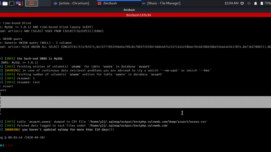
Visual representations, such as charts, graphs, and maps, can dramatically improve the efficiency and effectiveness of security audits. They transform large datasets of security logs, configurations, and vulnerabilities into easily understandable patterns and trends. This makes it significantly easier for security professionals to spot anomalies, identify potential threats, and understand the overall security health of a system or network.
Interactive visualizations allow for drill-down analysis, enabling teams to investigate specific events or issues in greater detail.
Examples of Using Visual Tools to Analyze Security Logs
Security log analysis is significantly enhanced by visual tools. For instance, a heatmap can visually represent the frequency of login attempts from different IP addresses over time. This visualization can immediately highlight periods of unusual activity or potential brute-force attacks. Similarly, a time-series graph can depict the volume of security events over a specific period, enabling identification of spikes or sudden increases that might indicate malicious activity.
These visual representations can provide a quick overview of security log data, facilitating the identification of anomalies and potential threats.
Demonstrating How Visualizations Can Identify Anomalies in Security Data
Visualizations are essential for uncovering anomalies in security data. For example, a scatter plot showing the correlation between user access privileges and the frequency of suspicious activities can highlight users with elevated privileges who exhibit unusually high levels of suspicious behavior. A geographical map showing the location of failed login attempts can help identify potential targeted attacks or malicious activity originating from a specific region.
These visualizations allow security analysts to quickly pinpoint anomalies that might otherwise be missed in a sea of raw data.
Table Comparing Different Methods for Visualizing Audit Results
This table compares various visualization methods, considering their strengths, weaknesses, and suitability for different audit scenarios.
| Method | Strengths | Weaknesses | Use Case |
|---|---|---|---|
| Heatmaps | Quickly identify high-frequency events, patterns, and potential threats. Excellent for visualizing large datasets. | Can be less effective at showing complex relationships between different data points. Might obscure nuanced details in favor of overall trends. | Security log analysis, identifying frequent login failures, suspicious IP addresses. |
| Time-series graphs | Excellent for tracking changes over time, spotting trends and anomalies. Clearly shows spikes and drops in security events. | Might not be ideal for highlighting complex relationships between different data points. Can be less effective for identifying correlations between different security events. | Monitoring security event volumes, detecting unusual spikes in network traffic, tracking system performance over time. |
| Scatter plots | Visualize relationships between two or more variables. Highlight correlations and outliers effectively. | Less effective for visualizing large datasets. Requires careful consideration of axes and data scaling to avoid misinterpretations. | Analyzing correlations between user access privileges and suspicious activities, understanding the relationship between security controls and vulnerabilities. |
| Geographical maps | Visually represent geographical distribution of events. Quickly pinpoint potential targeted attacks or malicious activity originating from a specific region. | Less effective for showing complex relationships between data points. Requires careful data aggregation and labeling to avoid ambiguity. | Analyzing failed login attempts, detecting network intrusions, understanding the geographical distribution of vulnerabilities. |
Case Studies and Real-World Examples
Visualizing information security isn’t just a theoretical exercise; it’s a powerful tool with demonstrable real-world applications. Effective visualizations can transform complex security data into easily digestible insights, leading to quicker identification of threats, more proactive security measures, and enhanced user understanding. This section explores how organizations are leveraging visual representations to bolster their security posture.Organizations are increasingly using visual tools to not only understand but also proactively address security risks.
From network traffic analysis to user behavior monitoring, visual representations allow for a more intuitive grasp of complex data, leading to faster incident response and improved security awareness.
Examples of Organizations Effectively Using Visual Representations
Visualizations are increasingly important for organizations of all sizes. Large corporations utilize these tools for strategic security planning and detailed incident response, while smaller businesses can use them for enhanced security awareness training and quick identification of emerging threats. Several organizations have successfully employed visual tools to improve their security posture. For example, a major financial institution used interactive dashboards to track network activity, enabling security teams to rapidly identify and respond to anomalies.
This proactive approach led to a significant decrease in security incidents. Another organization leveraged visual maps to visualize their network infrastructure, which helped pinpoint vulnerabilities and improve security control deployment.
Use Cases of Visualization in Incident Response
Visualizations play a crucial role in incident response. By rapidly visualizing threat activity, security teams can quickly understand the scope and impact of an attack, enabling quicker and more targeted responses. For instance, a network visualization tool can pinpoint the origin and spread of a malware infection, allowing for immediate containment measures. Similarly, interactive timelines can illustrate the sequence of events during a security incident, providing valuable context for investigation and future prevention strategies.
Visualizing attack paths can highlight critical vulnerabilities, guiding remediation efforts and bolstering the organization’s defenses against future attacks.
Case Studies Demonstrating the Impact of Visual Aids in Security Awareness
Visual aids can significantly improve security awareness training. Interactive simulations and infographics can make complex security concepts easier to understand, making users more aware of potential threats and how to mitigate them. For instance, a manufacturing company used animated videos to demonstrate the risks of phishing attacks. This interactive approach boosted user awareness and significantly reduced the number of phishing attempts successful.
Visualizations of common threats, such as password vulnerabilities and social engineering tactics, can make security best practices more memorable and engaging for users.
Table Summarizing Key Lessons Learned from Case Studies
| Case Study | Key Visual Element | Impact | Key Takeaway |
|---|---|---|---|
| Major Financial Institution | Interactive dashboards tracking network activity | Rapid identification and response to anomalies, significant decrease in security incidents | Visualizations facilitate proactive security measures and rapid incident response. |
| Network Infrastructure Visualization | Visual maps of network infrastructure | Pinpointing vulnerabilities and improving security control deployment | Visualizations are crucial for understanding network architecture and security posture. |
| Manufacturing Company | Animated videos demonstrating phishing risks | Boosted user awareness and reduced phishing attempts | Visual aids enhance user engagement and retention of security best practices. |
Summary
In conclusion, leveraging visual representations in information security offers a clear and compelling approach to understanding, communicating, and managing risks. By employing diverse visualization techniques, organizations can strengthen security measures, improve user awareness, and streamline audit processes. From simple charts to complex network diagrams, the visual yield of information security ultimately empowers us to navigate the digital landscape more securely and effectively.
The future of information security lies, in part, in our ability to translate complex concepts into accessible visual forms.