

Design Dogma Mobile Musings and the Social Sweet Spot at Web 2.0
The evolution of mobile design is intrinsically linked to the broader shifts in user interaction and societal engagement that defined Web 2.0. "Design dogma" in this context refers to the prevailing, often unstated, principles and best practices that guided mobile UI/UX development during this transformative period. These dogmas were not necessarily rigid rules, but rather a collective understanding of what worked best for users interacting with digital content on increasingly ubiquitous, yet still nascent, mobile devices. The "social sweet spot" represents the optimal convergence of mobile design features and Web 2.0 functionalities that fostered unprecedented levels of user-generated content, community building, and interpersonal connection. This article delves into the core tenets of mobile design dogma during Web 2.0 and explores how these principles contributed to the creation of the social sweet spot.
At the heart of Web 2.0 mobile design dogma was a profound emphasis on simplicity and clarity. Unlike the desktop web, which had been a playground for complex layouts and abundant information, mobile screens demanded a minimalist approach. Designers recognized that screen real estate was a premium commodity. This led to a dogma of intuitive navigation, where users could easily find what they were looking for with minimal cognitive load. Hamburger menus, while later criticized, became a dominant paradigm for consolidating navigation options on smaller screens. Tab bars emerged as another effective pattern for providing persistent access to core application sections, a direct response to the need for immediate accessibility. This focus on simplifying interaction was crucial for onboarding new mobile users who were accustomed to the more forgiving interfaces of desktop computing. The goal was to eliminate friction, allowing users to engage with content and social features seamlessly.
Another critical design dogma revolved around content-first presentation. Web 2.0 was defined by user-generated content: blogs, social media posts, photos, and videos. Mobile design dogma dictated that this content should be the star. This translated into design choices that prioritized legibility, clear typography, and uncluttered layouts. Images and videos were optimized for mobile viewing, and designers learned to create responsive designs that adapted gracefully to different screen sizes and orientations. The "thumb zone" became an informal but highly influential design dogma, recognizing that users primarily interacted with their phones using their thumbs. Elements like primary action buttons and navigation controls were strategically placed within easy reach of the thumb, enhancing usability and reducing awkward hand contortions. This pragmatic understanding of physical interaction was a cornerstone of effective mobile design.
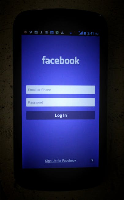
The rise of social integration was a defining characteristic of Web 2.0, and mobile design dogma rapidly embraced this. Features like "share" buttons, liking mechanisms, and commenting functionalities were not merely add-ons; they were fundamental to the experience. Designers strove to make these interactions effortless, often embedding them directly within the content itself. The dogma was to facilitate sharing and engagement without interrupting the user’s primary activity. This meant designing for quick glances, rapid interactions, and immediate feedback. Push notifications, initially met with some skepticism, became a vital tool for re-engaging users and alerting them to social interactions, further cementing the mobile device as a constant social conduit. The ability to connect with friends, family, and communities in real-time, facilitated by intuitive and socially aware mobile interfaces, was the essence of the social sweet spot.
Performance and responsiveness were also key dogmas, albeit often born out of necessity in the early days of mobile internet. Designers understood that slow-loading apps and websites would alienate users, especially on less-than-ideal network conditions. This led to a focus on optimizing assets, employing efficient coding practices, and designing interfaces that felt fast even when background processes were still loading. The dogma was to provide an immediate sense of interaction and feedback, even if full content rendering took a moment longer. Smooth transitions, micro-interactions, and subtle animations became tools to convey responsiveness and delight users, masking underlying technical limitations. This commitment to perceived performance was crucial for fostering user trust and encouraging prolonged engagement.
The concept of personalization and context-awareness began to emerge as a significant design dogma during Web 2.0 mobile development. As users became more accustomed to their mobile devices as extensions of themselves, designers started exploring ways to tailor experiences. Location services, user preferences, and past interactions were leveraged to deliver more relevant content and functionalities. While not as sophisticated as today’s hyper-personalization, the early dogma was to use available context to enhance the user’s experience, making the mobile device feel more like a personal assistant than a generic tool. This extended to social interactions, where understanding a user’s network and relationship status could inform the presentation of social feeds and connection suggestions.
Furthermore, the dogma of discoverability through social graph was central to the social sweet spot. Mobile apps and websites were designed to encourage users to connect with people they already knew, thereby expanding their network and increasing the pool of discoverable content. Features like "people you may know," friend recommendations, and the easy sharing of profiles were direct manifestations of this dogma. The mobile device became a powerful tool for extending and solidifying social bonds. The virality of content, a hallmark of Web 2.0, was often amplified by mobile design that made sharing and re-sharing effortless. This created a feedback loop where more connections led to more content, which in turn attracted more users and fostered deeper engagement.
The development of gestural interfaces was a significant technological and design shift that aligned perfectly with mobile design dogma. As touchscreens became standard, designers moved beyond button-based interactions. Swiping, pinching, and tapping became intuitive ways to navigate and interact with content. This dogma of leveraging natural gestures reduced the need for explicit instructions and made mobile interfaces feel more fluid and engaging. The social sweet spot benefited greatly from this, as gestural interactions could be used for quick actions like liking a post with a double-tap or dismissing a notification with a swipe, further streamlining social engagement.
The feedback loop of user data and iteration became an implicit but powerful dogma in Web 2.0 mobile design. The ability to collect analytics on user behavior allowed designers to understand what was working and what wasn’t. This data-driven approach led to continuous improvement and refinement of mobile interfaces and social features. The social sweet spot was not static; it was constantly evolving based on user feedback and usage patterns. This iterative process, fueled by the inherent trackability of digital interactions on mobile devices, was crucial for optimizing the user experience and maximizing social engagement.
Ultimately, the confluence of these mobile design dogmas during the Web 2.0 era created the social sweet spot. This wasn’t a single technology or feature, but rather a pervasive cultural shift facilitated by intelligent and intuitive mobile design. Users were empowered to create, share, and connect with an unprecedented ease, blurring the lines between their online and offline lives. The mobile device transitioned from a communication tool to a social hub, a platform for self-expression, community building, and constant connection. The design principles that guided this transition – simplicity, content-focus, social integration, performance, personalization, discoverability, gestural interaction, and iterative improvement – laid the groundwork for the highly connected digital landscape we inhabit today, even as the specific dogmas continue to evolve with new technological advancements and user expectations. The enduring legacy of Web 2.0 mobile design lies in its ability to transform how we interact with information and, more importantly, with each other, all within the palm of our hands.












No comments yet. Be the first to join the conversation!